Six widgets would ease your work by saving a lot of your time.
The following are those six widgets that would help to better understand and gain a clear overview of your project’s overall keyword performance.
- Widget 1: Today’s Serpple Score
- Widget 2: What’s Up Today?
- Widget 3: What’s on Top Today?
- Widget 4: Trending Keywords
- Widget 5: Deviating Keywords
- Widget 6: Favorite Keywords
Today’s Serpple Score
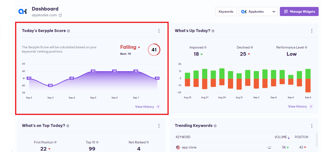
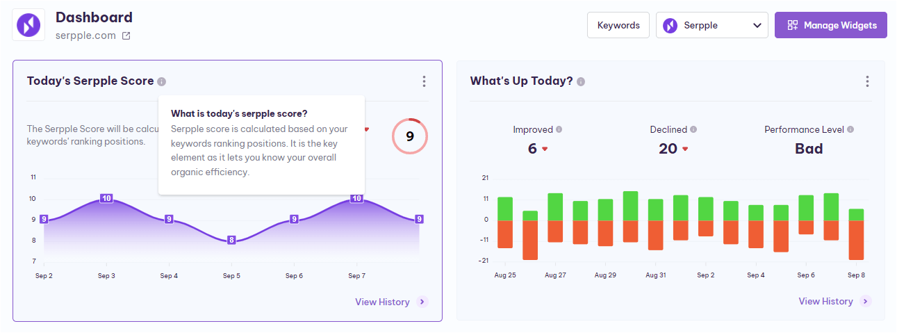
As the name sounds, this widget is to provide details of your Serpple Score. Next to the “Today’s Serpple Score” text, there is an “info icon” that gives you an explanation.
The specific day’s Serpple Score is in the top right corner of the widget and presented within the circle.
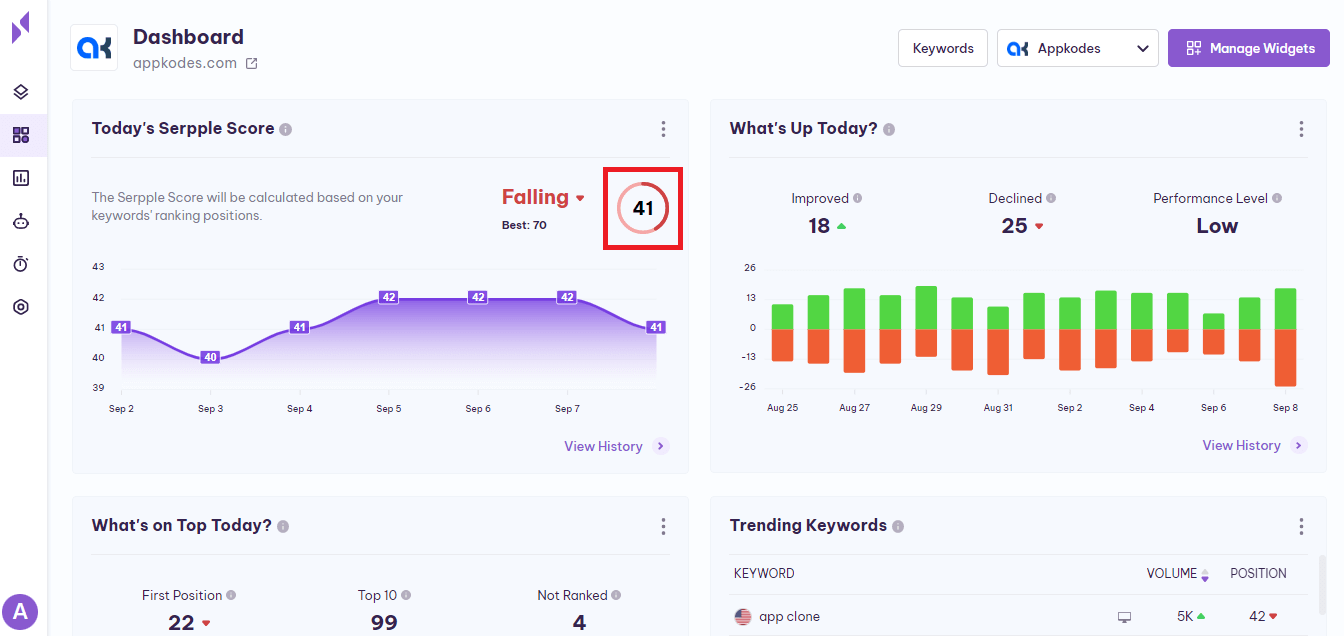
You can also know if your Serpple Score has, Improved, Declined, or has seen No Change and that is displayed before the Serpple Score which is presented within the circle.
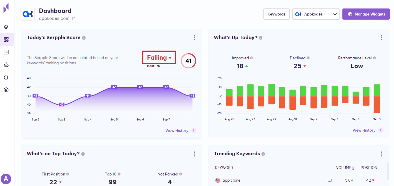
Next to this “Improved, Declined, No Change”, there is an up arrow or down arrow.
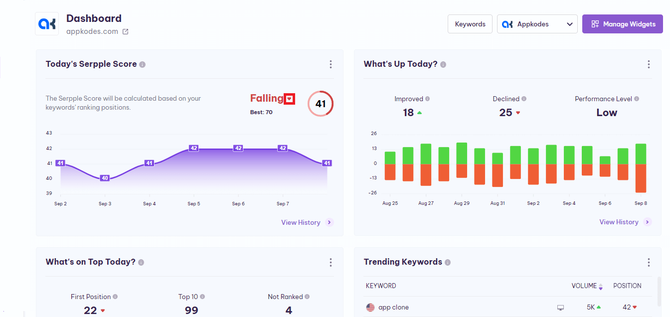
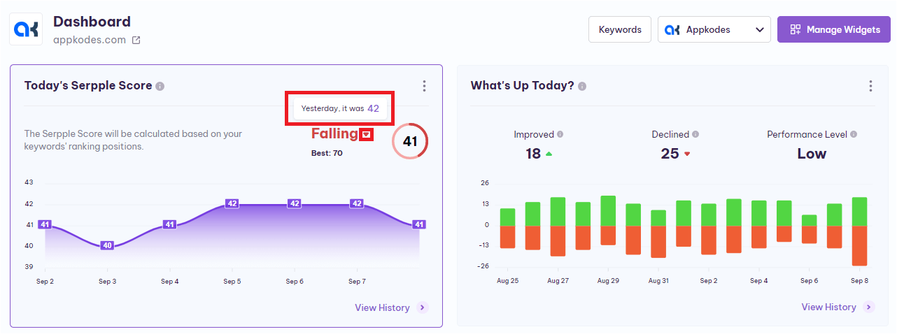
When you place the cursor on this up arrow or down arrow, a “ToolTip” will appear and provides you with the previous Serpple Score.
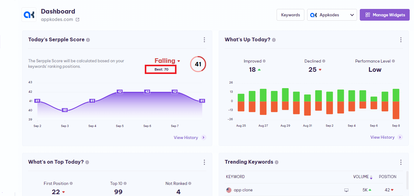
Below this “Improved, Declined, No Change”, there you can find the “Best”. It shows you the best Serpple score that the particular project has attained since the project has been added to the Serpple.
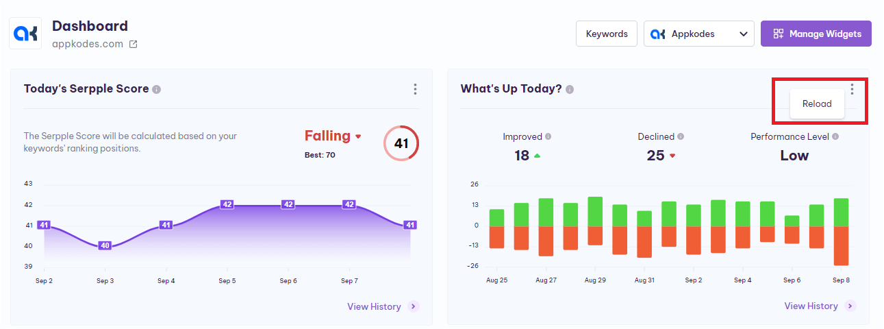
If you want to reload the “Today Serpple Score ” widget, click on the menu icon (three dots) in the top right corner of the widget, and then you can reload it easily by clicking the “reload” option displayed.
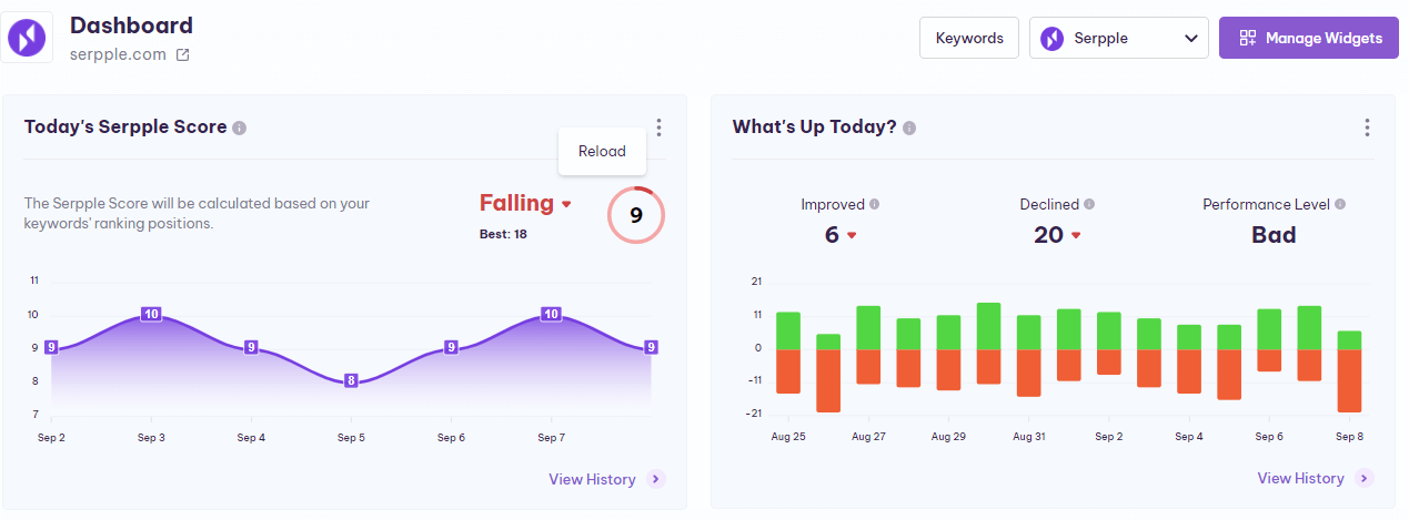
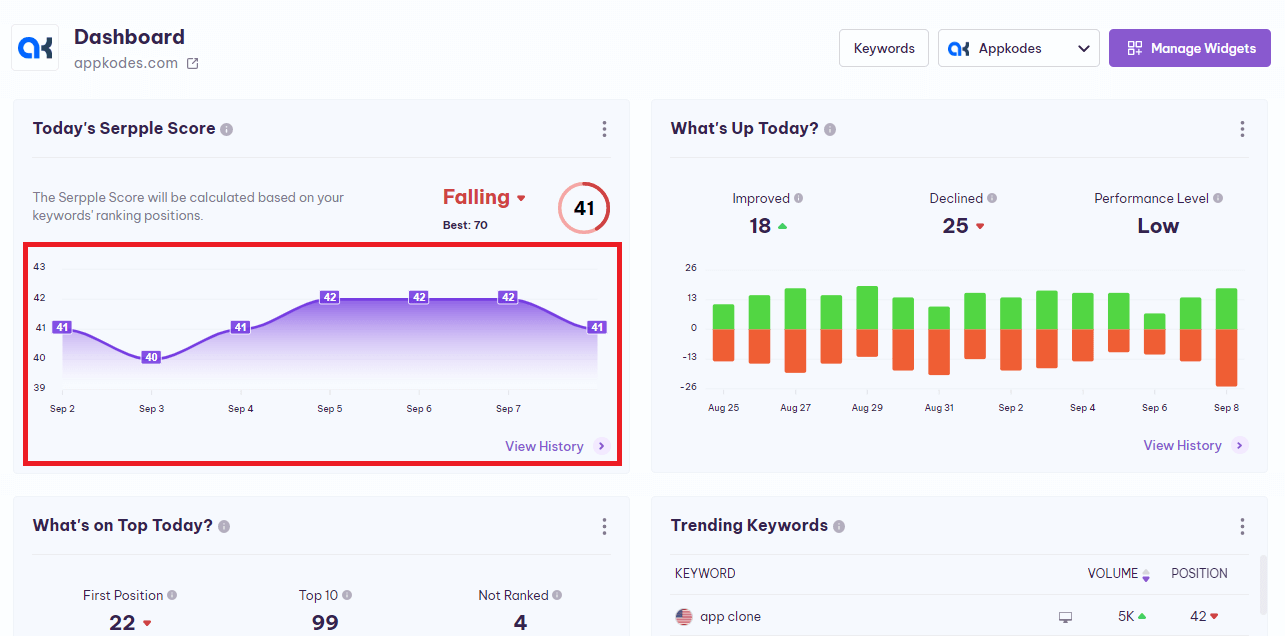
The last seven days’ Serpple Score history is in the bottom half of this widget and represented in graphical format.
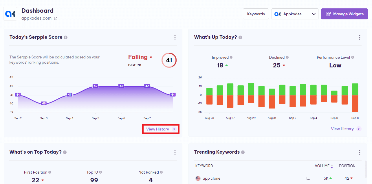
Additionally, you can view the Serpple Score history by clicking on the “View History” in the bottom right corner of the widget.
Above the graph, you will find 6 sections that help you to understand the Serpple Score history in more detail.
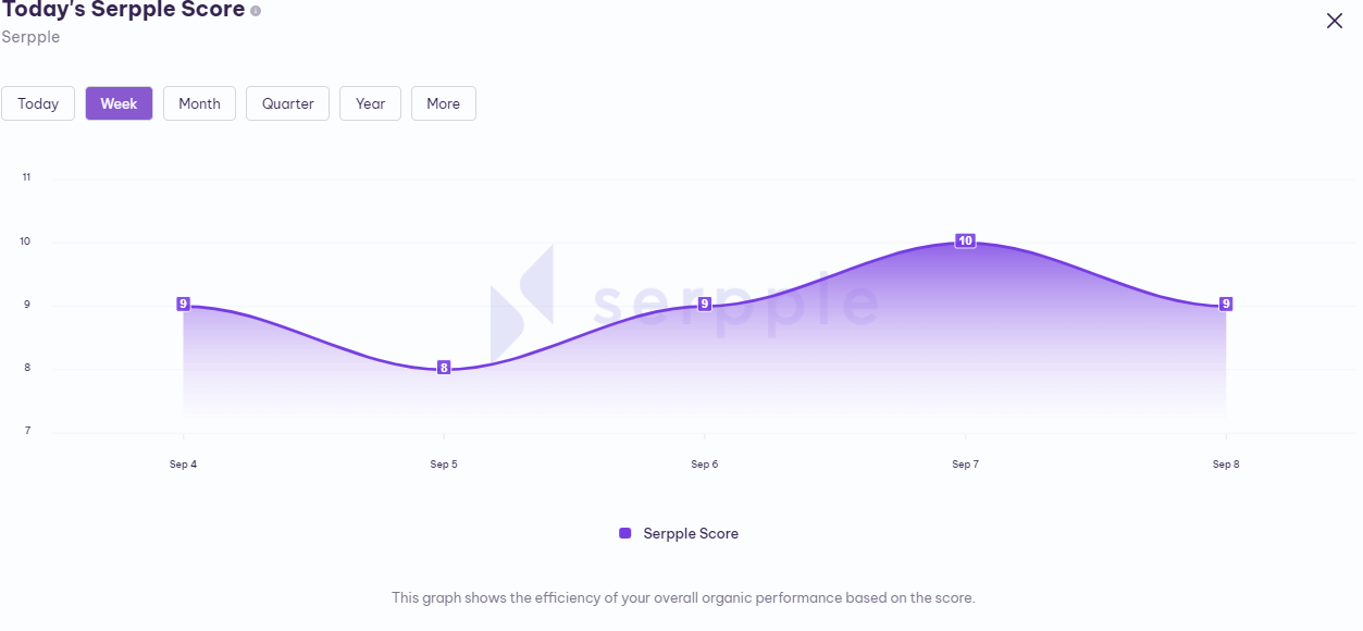
To get the Serpple Score history as per your need such as Today, Week, Month, Quarter, Year, and More.
Also, in the more section, you will find “Last week, Last month, Last quarter, Last year” Serpple Score history to go.
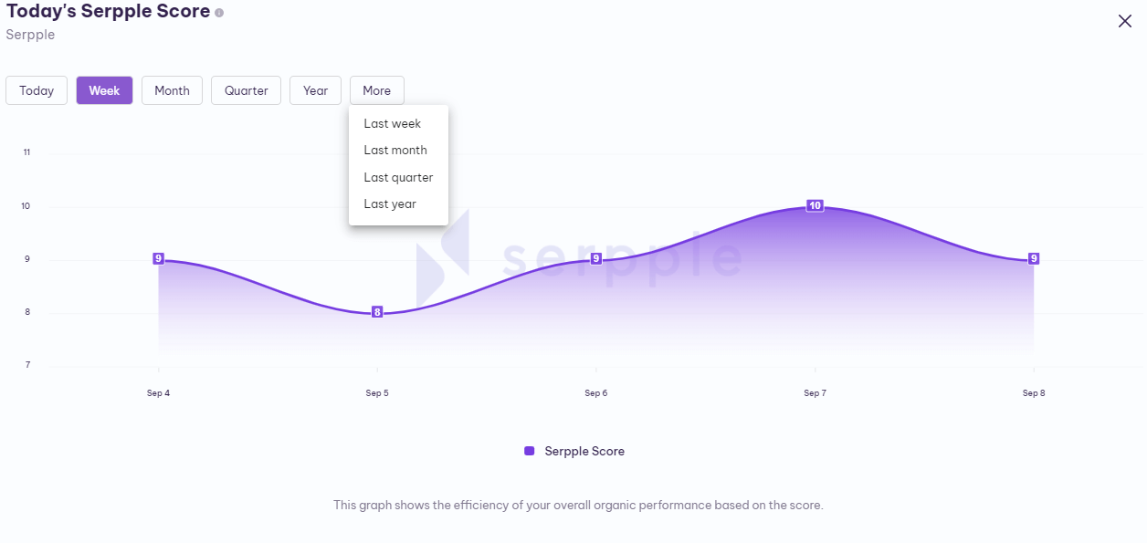
You can get the history of keywords by selecting any of the ones you need among the above-mentioned options.
These are the elements available in the “Today Serpple Score” widget helping you to analyze the overall progress of each project.
What’s Up Today?
Serpple let you quickly analyze the specific day’s keyword performance in the “What’s Up Today” widget.
In the “What’s Up Today” widget, you will find the number of improved and declined keywords in the rankings, activity level, and improved and declined keywords history in the form of a graphical representation (bar graph).
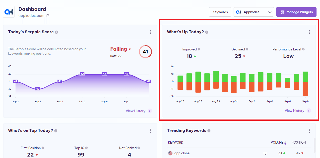
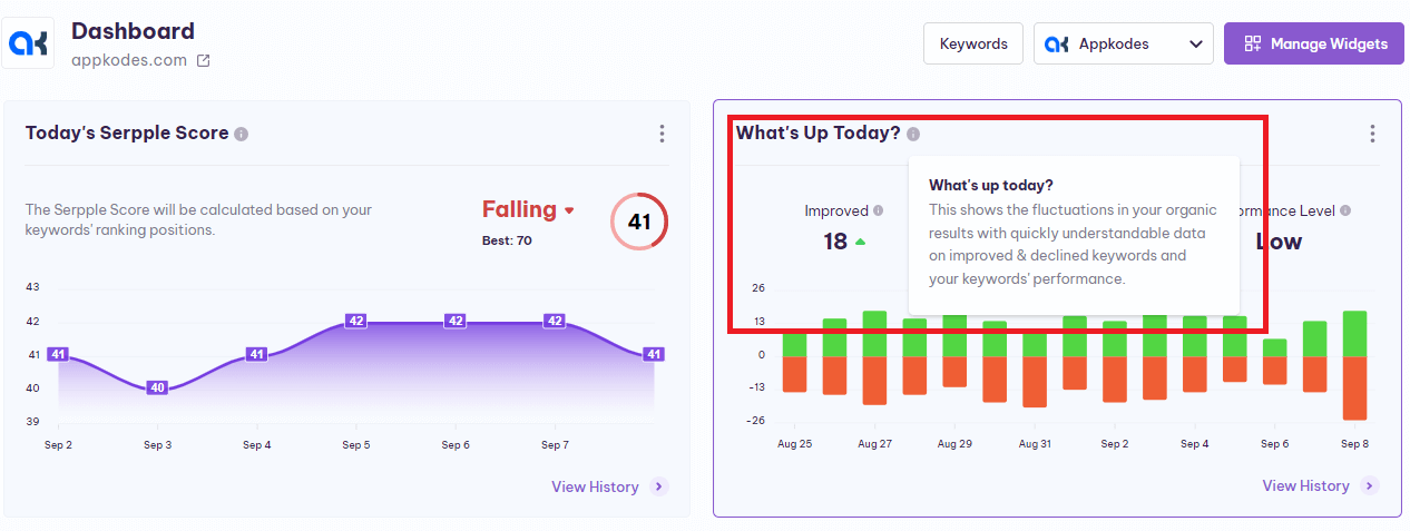
Next to the “What’s Up Today” title, there is an “info icon” that gives you an explanation.
Let’s take a look at this widget.
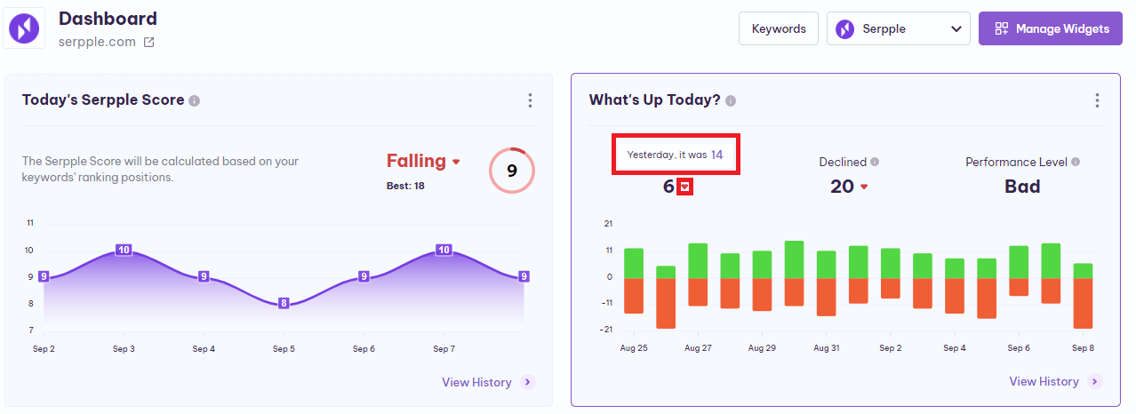
Improved – This represents the number of keywords improved in rankings after the refresh.
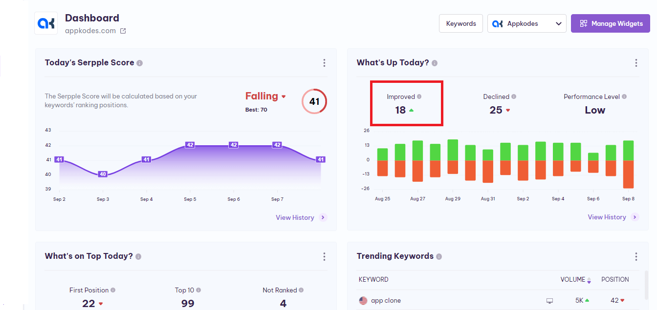
Also when you place the cursor on the number of the Improved keywords, a “tool tip” will appear with the previously improved keywords numbers.
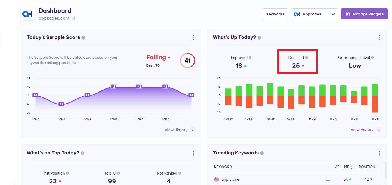
Declined – This represents the number of keywords that declined in rankings after the refresh.
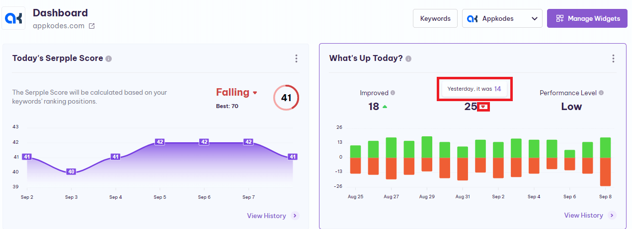
Also when you place the cursor on the number of the Declined keywords, a “tool tip” will appear with the previously declined keywords numbers.
Activity Level – By analyzing the number of improved and declined keywords, the activity level has been shown after the refresh There are five levels of activities. They are Low, Bad, Good, Moderate, and Excellent.
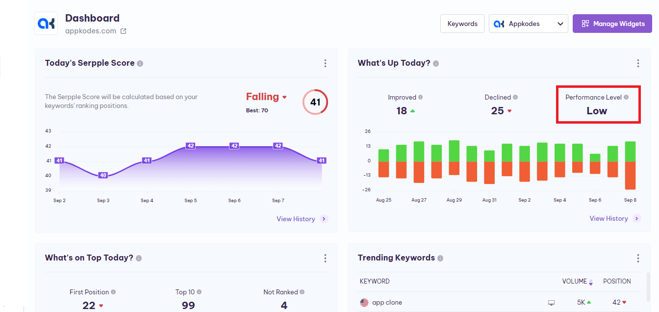
Also when you place the cursor on your Activity Level, a “tooltip” will appear with the previous activity level.
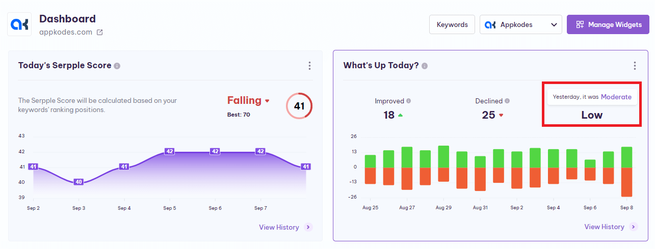
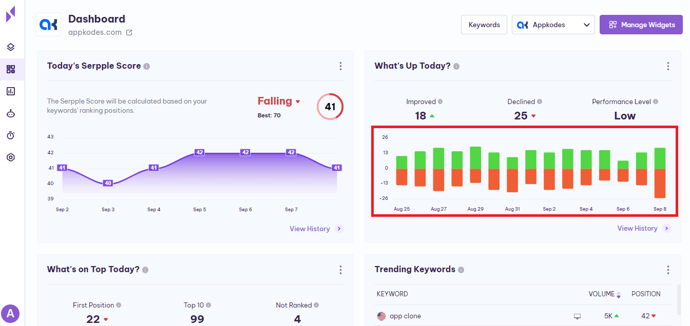
Improved and Declined Keywords(Bar Graph) – This bar graph shows the past fifteen day’s improved and declined keywords for the project. Also, Serpple has the standard colors for easy understanding of improved and declined keywords. It helps to identify the fluctuations of Google organic results.
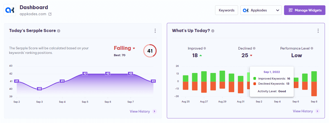
When you place the cursor on the specific day’s performance in the graph, a ”tooltip” will appear and shows you that particular day’s improved and declined keywords count and also that particular day’s activity level.
View History – By clicking the “View History” you will get the full view, which has various sections of history to understand better and analyze the progress.
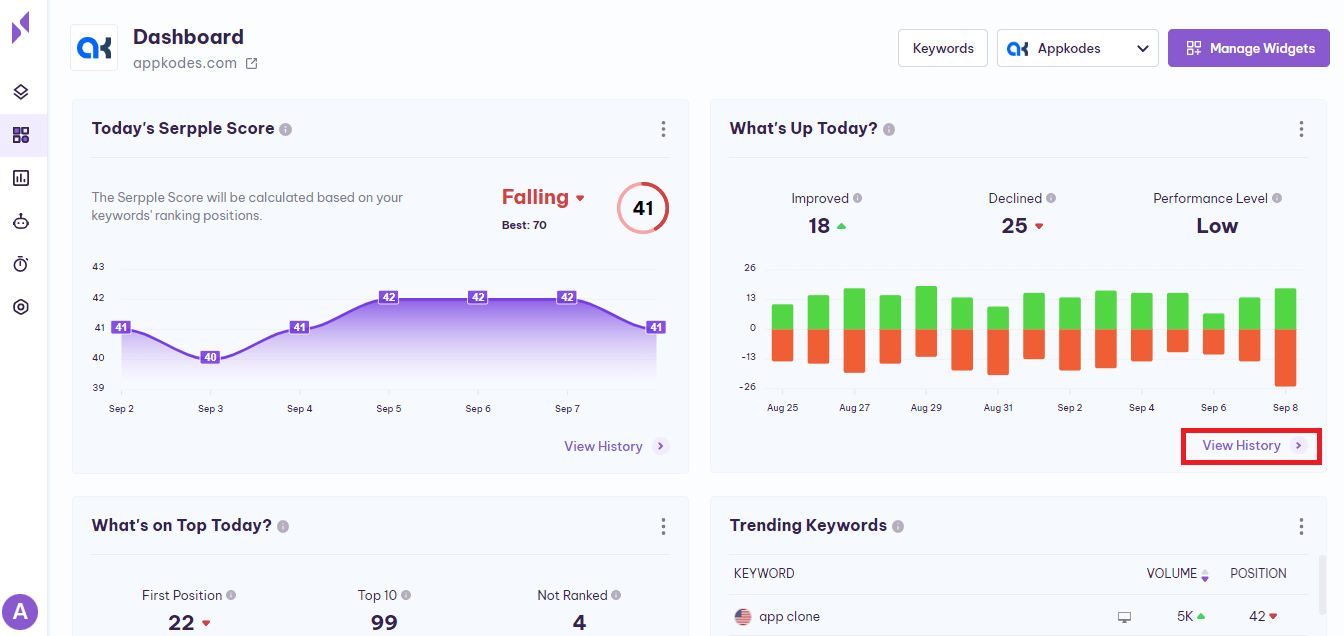
Five sections help you to understand the Improved and declined keywords history in more detail. They are Today, Week, Month, Quarter, More.
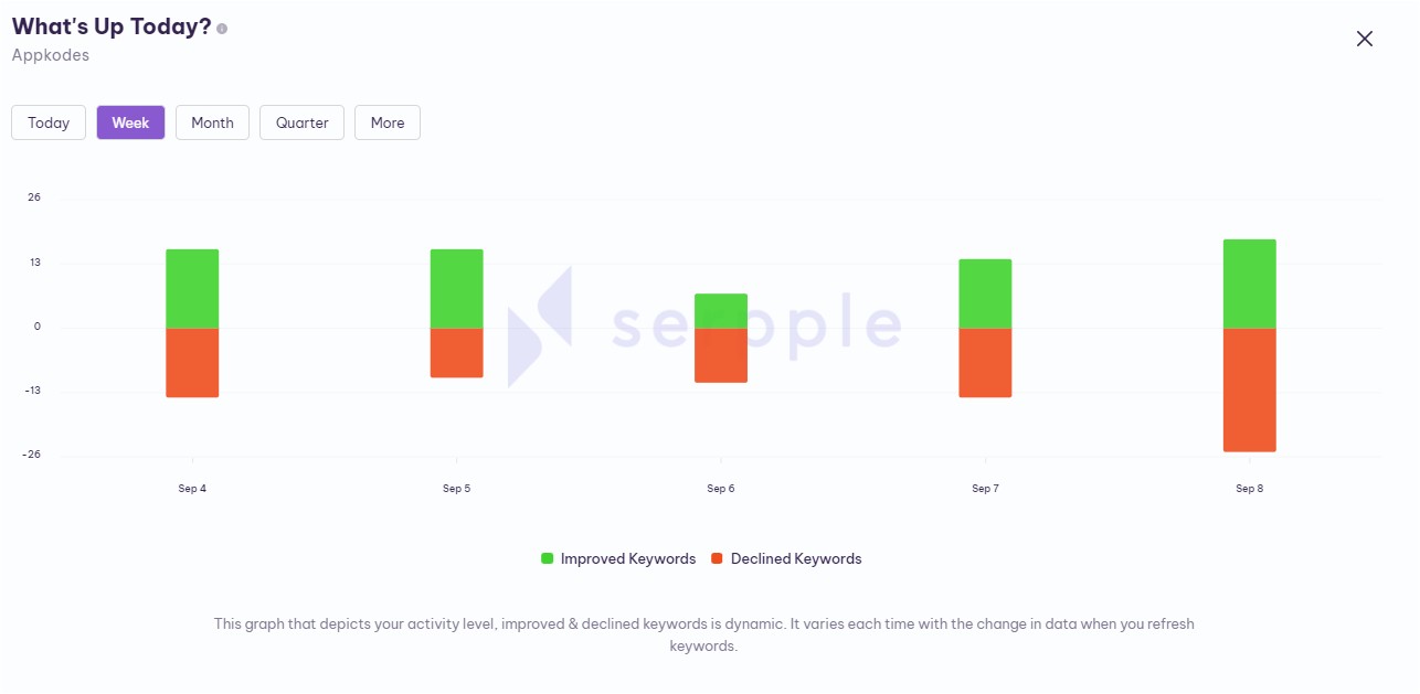
Also, in the more section, you will find Last week, Last month, Last quarter Improved, and declined keywords history to go.
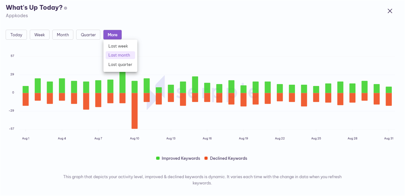
You can get the history of keywords by selecting any of the ones you need among the above-mentioned options.
Kebab Menu Icon – This Icon is used to reload this widget. Click this kebab menu icon to get the “reload” option. This helps to reload the specific widget instantly.
What’s on Top Today?
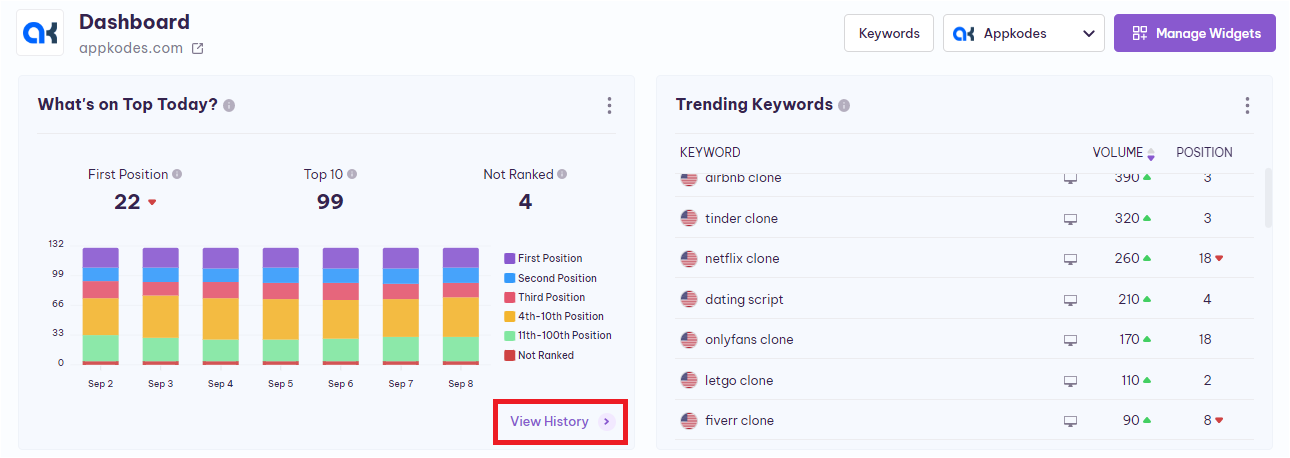
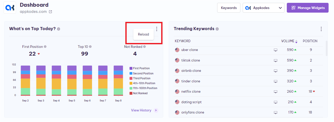
In this widget, you can find the number of keywords ranked in the first position, the number of keywords ranked in the top ten positions, the keywords that have not been ranked yet, and their history in the bar graphical representation.
Let’s take a brief look at this “What’s on Top Today?” widget one by one.
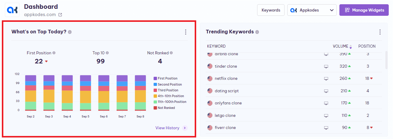
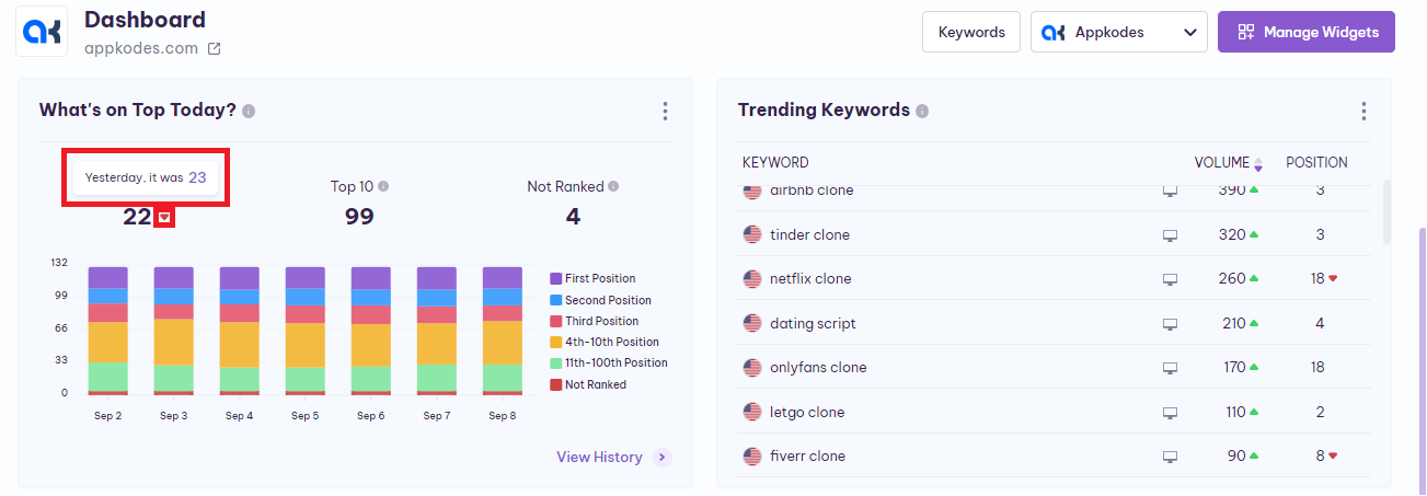
First Position – This shows you the number of keywords ranked in the first position and updates after every refresh.
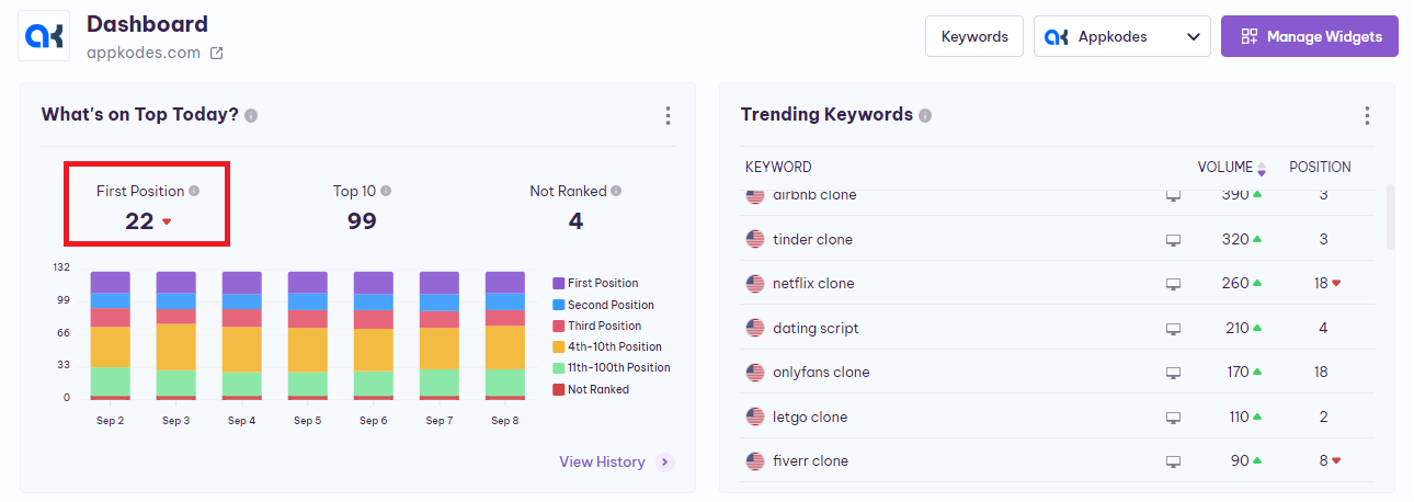
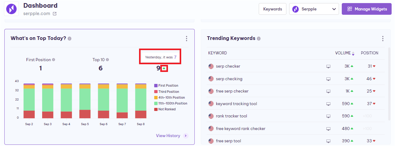
Also, when you place the cursor on the number of the First position keywords, a “tooltip” will appear with the previous number of the First position keywords.
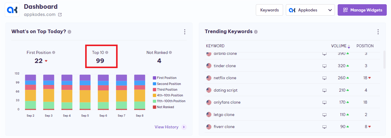
Top 10 – This shows you the number of keywords ranked in the top 10 positions in Google and it will update automatically after the refresh.
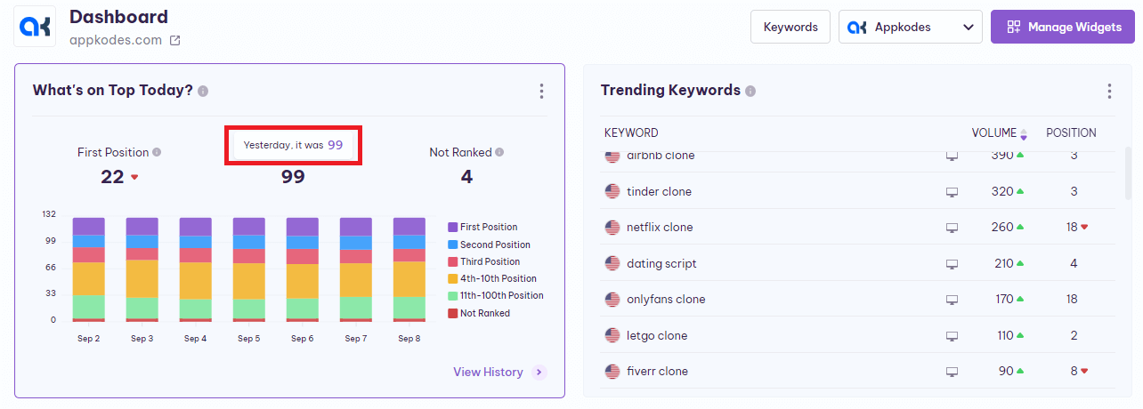
Also, when you place the cursor on the number of the Top 10 keywords, a “tooltip” will appear with the previous number of Top 10 keywords.
Not Ranked – How its name sounds “Not Ranked”, shows you the number of keywords that were not ranked in the top 100 and it gets updates after every refresh.
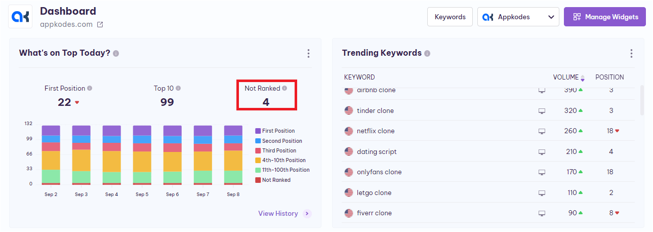
Also, when you place the cursor on the number of the Not ranked keywords, a “tooltip” will appear with the previous number of not ranked keywords.
Bar Graph – This bar graph displays the keyword’s various ranking positions in different colors. It helps to identify the fluctuations of Google organic results. You can identify this by knowing the colors divided for the various types of rankings.
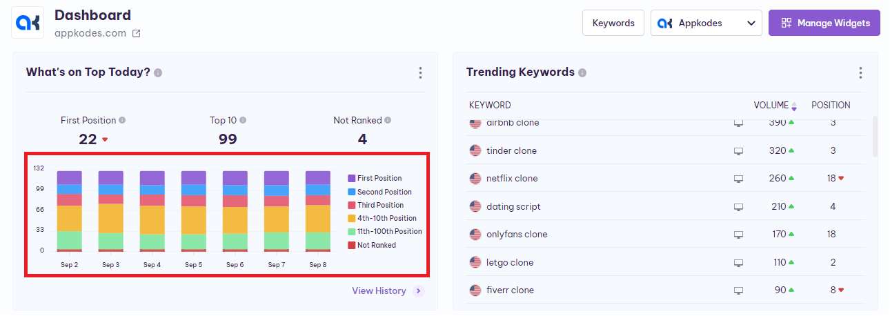
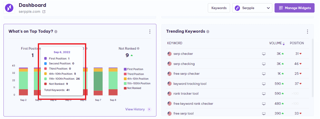
When you place the cursor on the specific day’s keyword ranking performance in the graph, a ”tooltip” will appear and shows you that particular day’s first position, second position, third position, 4 – 10 position, 11 – 100 position, and not ranked keywords count and also with total keywords count.
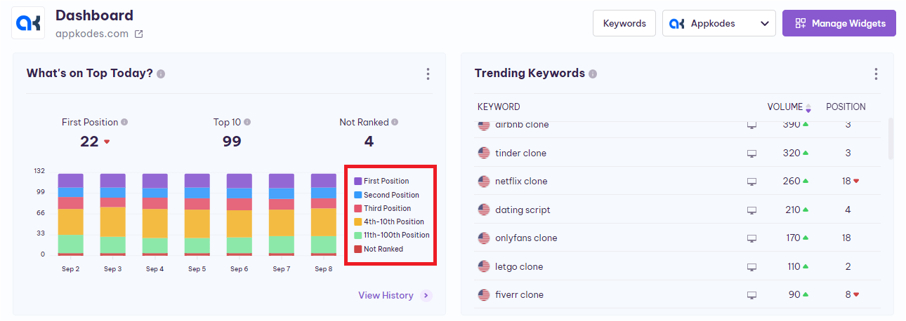
Color Representations – This shows you the color variants that represent the types of rankings. This will help you quickly understand the bar graph.
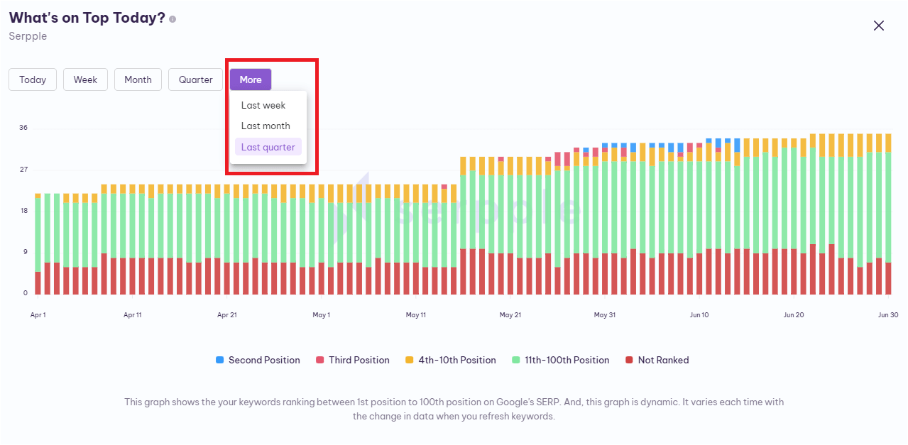
View History – By clicking the “View History” in the bottom right corner of the widget, you will direct to the page with the full view.
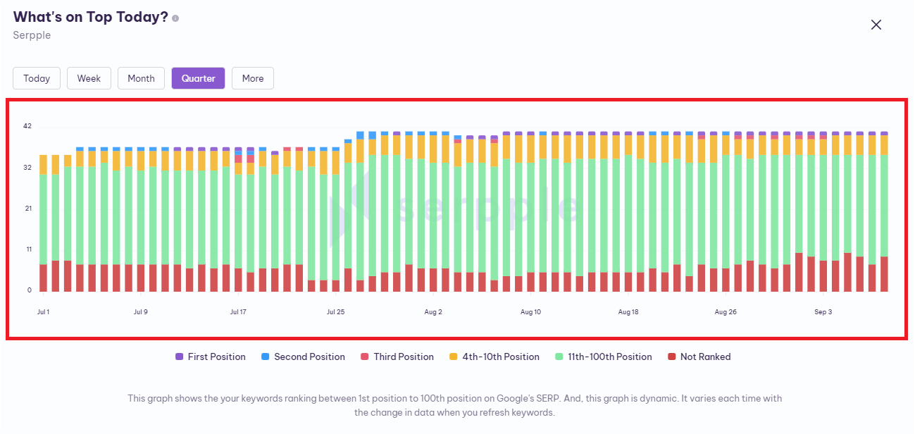
This page has various sections of history to better understand and analyze the progress. Additionally, the history graph shows you the Google rankings more deeply.
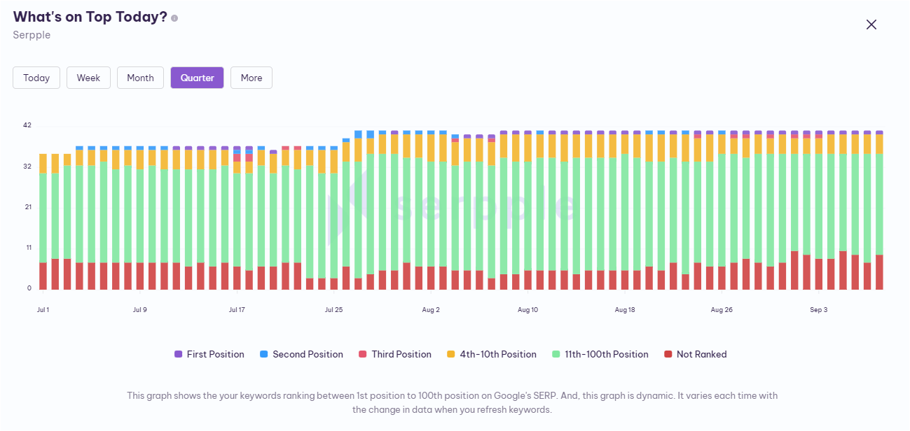
The six types of Google rankings separated in this history are “First Position, Second Position, Third Position, 4 -10 Position, 11 – 100 Position, Not ranked”.

This graph helps you to track the types of Google ranking you are having.
Above the graph, there are Five sections that help you to understand the Google ranking positions history in more detail. They are “Today, Week, Month, Quarter, More”.
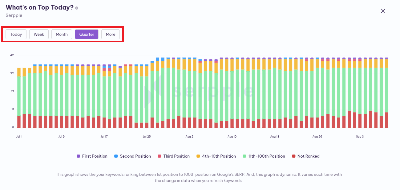
You can select the specific history by clicking the one that you need among these five. And in the more section, you’ll easily find your “Last week, Last month, Last quarter” history.
Kebab Menu Icon – By clicking this kebab menu icon in the top right corner of the widget, you will get the “reload” option. This helps to reload this specific widget instantly.
I hope you find this article useful and help you understand the “widgets” available in our dashboard section.
Do you have any other doubts? Are you in search of relevant help articles?
If so, then contact our support team by clicking on the live chat widget on the bottom right corner of this page.
You can also send an e-mail explaining your queries in detail to [email protected]
